

GOBO stands for “GOes Before Optics.” In lighting terms, a GOBO is a physical or digital template placed inside or in front of a light fixture to project an image, pattern, or message onto a surface. From a design perspective, GOBOs extend an identity system into a space without adding physical objects, and they require the same consideration as any other brand application.
What GOBO lighting does well
GOBO lighting excels at reinforcing brand presence without competing for attention. A well-designed GOBO can create rhythm, repetition, and cohesion across a venue while still allowing architecture, content, and people to remain the focus. GOBOs are especially effective when they are treated as part of a visual system rather than a standalone moment. When the same shapes, patterns, or marks appear across stage graphics, motion content, signage, and projections, the experience feels intentional and unified.
Spaces that work best for GOBOs
GOBOs work best in spaces that offer visual clarity. Large ballrooms, pre-function areas, and entry corridors provide scale and predictable surfaces that allow projected graphics to read cleanly. Outdoor courtyards and tented spaces can also be effective, particularly in the evening, when light becomes a primary design element. In darker environments, GOBOs often serve a dual role as both identity and lighting. In these spaces, projections function as wayfinding cues, mood setters, and brand reinforcements.
Where GOBOs tend to fall short
GOBOs fail when the environment works against them. Highly textured walls, patterned surfaces, or visual clutter can break up projections and undermine legibility. Spaces with uncontrolled daylight often wash out projected graphics, especially during daytime sessions. Low ceilings packed with fixtures can also make GOBOs feel incidental rather than deliberate. Design judgment matters here. GOBO lighting should enhance a space that is already working visually. It is not a fix for poor layouts, crowded signage plans, or weak spatial design.
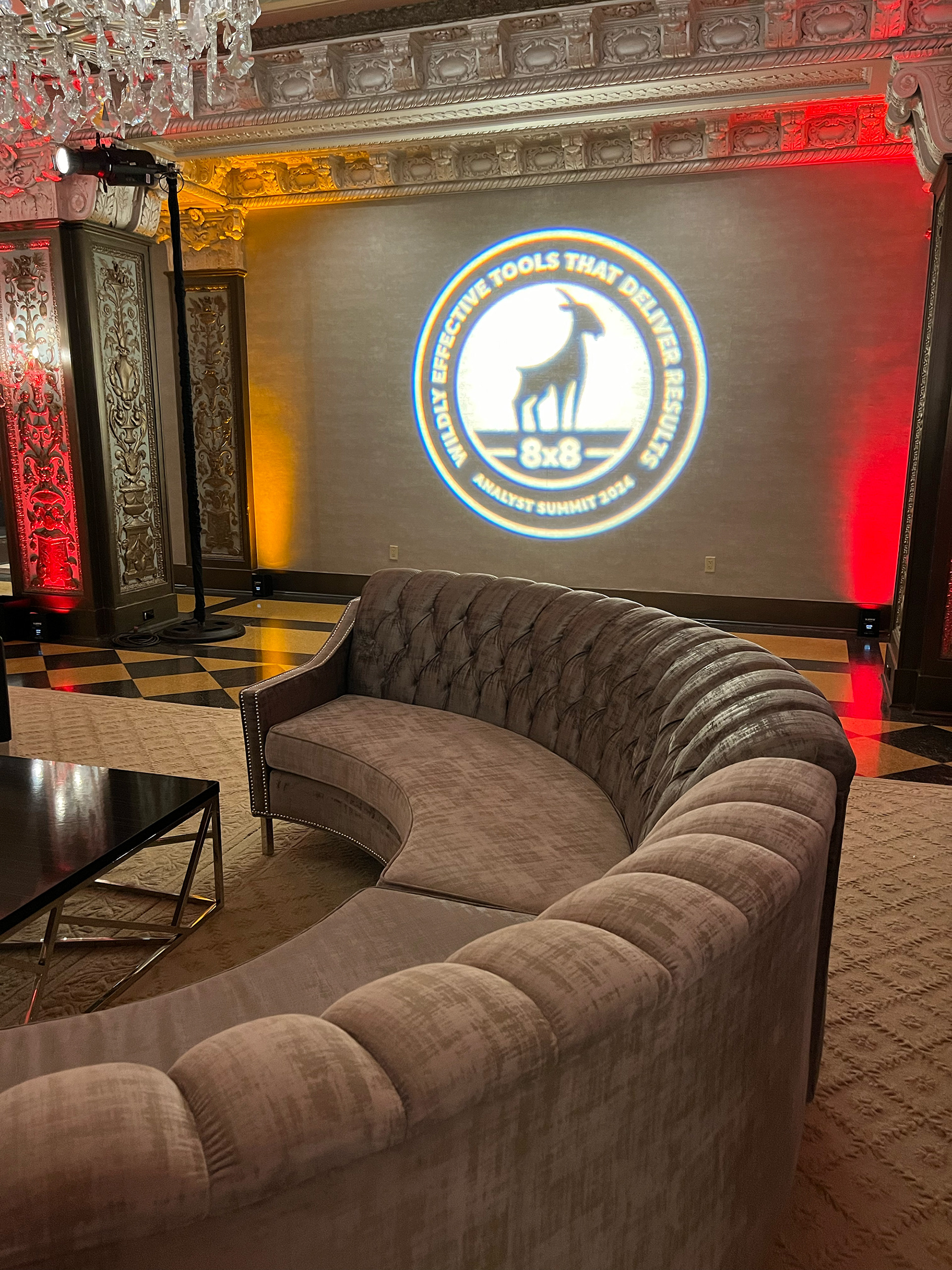
What content works best when designed for projection
Designing for GOBOs requires restraint. Logos with bold forms and strong negative space translate better than detailed lockups. Icon-based marks often outperform full wordmarks, especially when projected at large scale. Thin strokes, fine details, and small typography rarely survive projection intact. Typography works best when it is treated as a graphic element rather than a reading experience. Single words or short phrases set in bold, confident typefaces hold their form as people move through a space. Abstract patterns and brand textures are often the most effective use of GOBO lighting, adding depth and energy without relying on legibility. When these elements are pulled directly from an existing identity system, they reinforce brand consistency in a subtle way.
Color, contrast, and scale
When designing GOBO content, contrast matters more than exact color matching. White or warm white projections typically read the cleanest across a range of surfaces. Colored GOBOs can work, but only when the environment and lighting conditions are carefully controlled. From a composition standpoint, larger projections tend to feel more intentional. Overscaling a mark or pattern often creates a stronger architectural presence than placing smaller, repeated logos. Cropping is also an effective design tool. Allowing logos or patterns to bleed off walls or floors can create a sense of scale and confidence that feels more considered than forcing a complete mark into every projection.
Designing for movement and event flow
Projections are most effective in transitional spaces such as entries, corridors, and pre-function areas where people are moving. In these moments, GOBOs act as visual punctuation rather than focal points. Timing also matters. GOBOs can establish tone during arrival, reinforce identity between sessions, and bring energy back into a space during evening receptions. Designing for these moments ensures projections support the experience instead of competing with content.
Collaboration through a design lens
While lighting and production teams handle execution, designers play a critical role in setting GOBO direction. Providing artwork designed specifically for projection helps avoid compromises later in the process. Understanding how scale, contrast, and surface interaction affect legibility allows designers to make smarter creative decisions before anything reaches the venue. The strongest results come when designers are part of the conversation early and treat GOBOs as a design deliverable, not a technical afterthought.
GOBOs as part of a cohesive design system
GOBO lighting is most successful when it supports a broader visual system. When projections align with stage design, motion graphics, signage, and printed materials, the environment feels cohesive and intentional. GOBOs should never feel decorative or disconnected from the rest of the brand language. When used intentionally, GOBO lighting becomes a powerful extension of a brand system rather than a temporary effect.
Human insight with a touch of AI